When it comes to business communication, accuracy is everything. Print errors can lead to serious problems. Imagine you’re in charge of sending out invoices or financial reports. If these documents have mistakes or arrive late, it could upset your customers and hurt your business’s image.
This blog will help you identify and steer clear of common printing errors. Let’s walk through the steps to keep your print quality consistent and professional, so that every time you send something out, it shows your business in the best light.
Why Print Quality is Important
Print quality plays a major role in the effectiveness of your printed materials. High print quality makes your documents look professional, sharp, and visually appealing. These details reflect the standards of your brand, making a positive impression on your customers.
Low-quality printing, characterized by blurry images, jagged lines, and visible pixelation, detracts from the message you want to convey. It’s important for your images and text to be crisp and precise, capturing the attention of your viewers effectively.
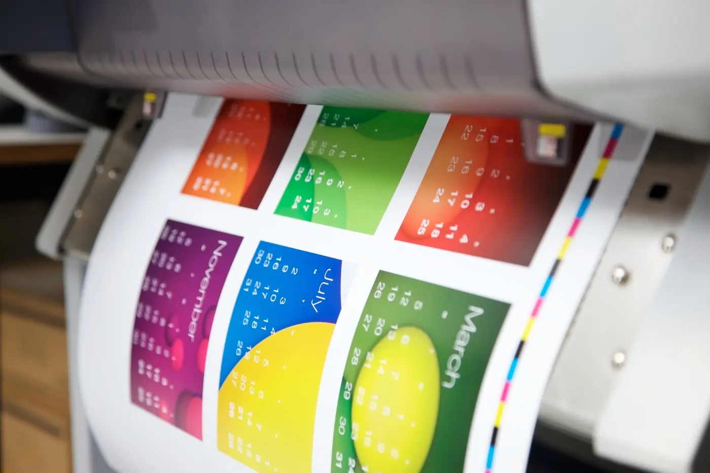
Using rich, vibrant colors in your prints makes your materials stand out even more! Consider the difference between a flyer with muted, lifeless colors and one bursting with vibrant hues; the latter is far more likely to attract and hold someone’s attention.
Avoiding Mistakes in the Printing Process
Printing doesn’t have to be a headache! By following these simple tips, you can avoid common mistakes and consistently produce quality print results:
Design in Programs Meant for Print Design
Design programs play a crucial role in the world of print design. These programs are tailor-made to assist in the prepress process, ensuring that design files are properly prepared for print:
- Adobe InDesign: This program is widely used for layout and typesetting of print materials such as magazines, brochures, and books. InDesign offers precise control over typography, images, and page elements, making it ideal for professional print design.
- Adobe Illustrator: Illustrator is popular for creating vector graphics, logos, and illustrations. It is a powerful tool for creating scalable artwork that can be easily resized without losing quality. Design files created in Illustrator can be seamlessly exported for print.
- Adobe Photoshop: Photoshop is primarily used for editing and manipulating images. It allows designers to enhance, retouch, and adjust photos to achieve the desired look and feel for print designs. Photoshop files can be saved in various print-ready formats.
By utilizing these design programs, your team can ensure the proper preparation of design files for print. These programs offer advanced tools and functionalities that support accurate color management, resolution control, and file compatibility with print devices.
Set the Design Up Correctly for Print
It’s essential to confirm your print job specifications. This means double-checking things like the size, color mode, resolution, and file format. These details are crucial to ensure your design looks as intended on paper.
One big design mistake to avoid is forgetting to embed fonts in your design. If the printer doesn’t have the right font installed, your design won’t look right. So, be sure to embed those fonts before sending off your print file.
Another mistake to watch out for is using low-resolution images. Printing requires higher resolution than what you usually use for online graphics. Check that your images are high enough in resolution for printing to avoid any pixelation or blurriness.
Check for Bleed and Trim Marks
Bleed areas are extra space around the edges of your design, and trim marks are the tiny lines that show where the cutting should be done. Sounds simple, right? But let me tell you, they are crucial.
Think of bleed areas as your design’s safety net. They stretch your image slightly past where the page will be cut, so you avoid those annoying white edges. This way, your image beautifully fills the entire space, giving it a clean, professional look.
And about those perfect pictures? Without bleed areas, they might get trimmed off at the edges, ruining the vibe. Bleed areas ensure your full image makes it onto the page, with no awkward cropping involved.
Trim marks are your printer’s guide for precision cutting, showing exactly where to slice so everything lines up just right. No one wants a lopsided design, right?
Always chat with your printer about this. They’ll help you figure out the right bleed and safe zone sizes for your project, ensuring everything turns out perfectly so you can avoid costly mistakes.
Proper File Format for Printing
Let’s talk file formats—specifically, bitmap and vector graphics. These two players are crucial in determining how sharp your print comes out, so picking the right one is key!
Bitmap graphics are your JPEGs, PNGs, and the like, composed of countless tiny pixels. Have you ever zoomed into a bitmap image and noticed it gets blurry or pixelated? That’s because these images have a fixed resolution, limiting how much you can enlarge them before they lose clarity.
Then there’s the vector graphics squad, featuring stars like EPS and AI files. These are crafted from mathematical formulas, not pixels, allowing your printer to scale the image up or down without a hitch. This means vectors keep their crispness at any size, giving you a lot of leeways to play with.
In the print game, choosing the correct file format is crucial. If your design is detail-heavy or needs to be scalable, vector is the way to go. Bitmap will serve you well for straightforward images or photos.
Designing for the Requested Finish Size
To hit the mark on the requested finish size in design, here are some steps to follow:
- Figure out the design dimensions: Get a clear understanding of the project’s size and specifications. Knowing the exact space you have to play with is crucial.
- See it life-size: Always check your design at a 1:1 scale. This means looking at it in its true size, not zoomed in or out. It’ll give you a real sense of how it’s going to look in the physical world.
- Readability is key: Make sure any text in your design is easy to read at its final size. Pay attention to font sizes and styles, and watch out for any readability issues that might pop up.
- Does it pop?: Does your design grab attention When you view it at the actual size? If it feels too small or lacks impact, think about tweaking the size or adding elements to make it more striking.
- Simplify if needed: Be careful with overly intricate details. What looks good on a large scale may lose its charm or become too complex when scaled down to the finished size. Stick to clean, clear details that translate well in print.
By following these steps, you’ll ensure your design not only fits the finished size perfectly but also looks great and communicates effectively.
Using High-Resolution Images for Print Quality
Finally, why are high-resolution images so crucial? Low-resolution images can end up causing some major issues when it comes to printing. You might notice pixelation or blurriness in your prints, and that’s not what you want!
To make sure any images being used for your print job come out sharp and clear, here’s what you should do:
- Start with a high-resolution camera for your photos. This captures all the fine details, ensuring your images look fantastic digitally and on paper.
- Pay attention to your image file formats. While JPEGs are common, they tend to compress and reduce image quality. Opt for TIFF or RAW formats instead, as they retain all the image details and ensure top-notch quality.
- Be mindful of image scaling. Enlarging a low-res image often leads to a loss of clarity. It is always better to begin with a high-res image and size it down if necessary, to keep everything looking sharp.
Common Color Mistakes to Avoid in Print
You might not realize it, but the colors you choose can make a big difference in how your print materials turn out.
Color Management
Color management is all about ensuring the colors you see on your computer screen match the colors in your final printed piece. Seems pretty important, right? You don’t want your bright and vibrant design to end up looking dull and lifeless in the end.
That’s where color calibration comes in. It’s all about adjusting and fine-tuning your computer monitor to display colors accurately. You want the red on your screen to look like red in real life, not some weird shade of orange, am I right?
Next up, we have color profiling. This little gem helps us map out the colors that we can actually reproduce in our prints. It’s like creating a little color roadmap, so we know what to expect and can avoid any surprises.
And let’s not forget about color proofing. This step allows us to print out a small sample of our design to see how the colors will look on paper. It helps us catch any issues and make adjustments before the final print run.
Understanding PPI vs. DPI
What’s the difference between PPI and DPI? Let’s break it down!
PPI stands for “Pixels Per Inch.” You’ve probably heard of pixels before – those tiny dots of color that makeup images on your screen. Well, PPI tells us how many of these pixels are in just one inch of space. The higher the PPI, the more pixels there are, which means a crisper and more detailed image.
On the other hand, DPI stands for “Dots Per Inch.” Now, you might wonder, “Wait, aren’t pixels and dots the same thing?” They kind of are, but there’s a slight difference. DPI is used when we’re talking about printing or physical output. It tells us how many dots of ink or toner will be placed in one inch of space on a printed document. Again, just like with PPI, the higher the DPI, the sharper and more detailed the printed image.
Final Thoughts
It’s clear that in the world of business communication, precision is non-negotiable. Print mistakes can be more than annoying; they can seriously affect your business reputation and customer relationships.
Printing is an art and science combined, requiring attention to detail at every step. By following the guidelines we’ve discussed, you can ensure that your printed materials look professional and speak volumes about your brand’s commitment to quality. And hey, if this all seems daunting, don’t sweat it! PMSI is here to help. With our expertise in full-service commercial printing, we can guide you through the process, ensuring your materials come out looking top-notch every time. So, if you’re ready to leave print worries behind and want your business to shine in the best possible light, let’s chat!
Reach out to us and let’s make your print projects a high-quality success.